
ICOS Curve
The interactive ICOS curve above shows the change in CO2 concentrations in the atmosphere above Europe over time. The Curve uses observation data from 38 ICOS Atmosphere stations in Europe. It shows the median from these stations as a thick line and the differences between the stations as coloured areas.
The ICOS Curve enables an easy way to see the greenhouse gas concentrations from different parts of Europe in the same picture. The data is updated daily, giving recent information on CO2 concentrations and trends.
On the ICOS Curve tool at curve.icos-ri.eu, you can select one or several stations, visualise the data and compare the stations to the median of all ICOS stations, each other or to global averages. The ICOS Curve tool at curve.icos-ri.eu also has Methane and Nitrous Oxide curves in addition to the Carbon Dioxide visualisation.
What are the light blue and darker blue areas in the ICOS Curve?
The ICOS Curve shows daily updated observation data from the ICOS Atmosphere stations located in the Northern Hemisphere. The dark blue line is the median of the monthly values from all 38 stations. The darker blue area encompasses 50% of the values around this median; the lighter blue region encompasses 90% of the values around the median.
The shades tell that there is variation in the CO2 concentration values measured at different stations, although all the stations measure exactly the same way. The stations are located all over Europe (and beyond) and the differences between them are due to regional influences: while, for example, one tower is in a region with high emissions, another is surrounded by forests and agricultural land. In addition, the weather influences the air flows to the stations, sometimes bringing air parcels from high-emission areas to far away regions.
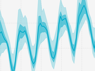
What are the ups and downs seen in the curve?
The ups and downs in the Curve reflect the seasons (spring, summer, etc.), since the atmospheric CO2 decreases in spring and summer due to the uptake of CO2 by land ecosystems. During this time of the year, photosynthesis, the uptake of CO2 by plants, is high. When leaves are falling in autumn, natural production of CO2 by respiration and emissions from fossil fuel burning become larger than photosynthesis and the CO2 concentration increases again. This seasonal up-and-down pattern is much more pronounced in the ICOS curve than in the global average or the Keeling Curve measured at Mauna Loa because most of the ICOS Atmosphere stations are located at the continental land surface. Despite the higher annual amplitude in the ICOS curve, the trend in all curves is the same, showing a continuous rise of the CO2 concentration in the atmosphere.
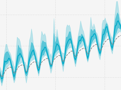
What is the grey dotted line in the ICOS Curve?
The grey dotted line is a product provided by NOAA, the National Oceanic and Atmospheric Administration of the US. It’s the monthly mean CO2 concentration globally averaged over selected background marine surface sites. The ICOS curve and the NOAA global average show almost exactly the same growth rate of CO2 in the atmosphere. The annual average CO2 value of the ICOS curve is about 20-30 ppm higher than the global curve due to the presence of regional sources to the ICOS stations and the, on average, more northerly location compared to the marine stations used by NOAA. This also results in sharper and faster increases in Northern Hemisphere autumn and early winter and minima in summer.
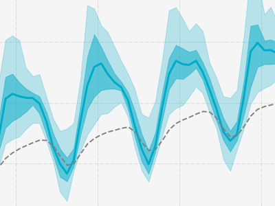
Why are European CO2 averages higher than global?
The blue ICOS curve is almost constantly above the grey global dotted line, which means the European CO2 averages are higher than the global averages. This is because the carbon dioxide emissions are produced, besides those from natural cycles, by human activity and mostly by burning fossil fuels. Europe is densely populated and emits vast amounts of CO2 from fossil fuel burning. Consequently, Europe is a hotspot area for CO2 compared to other regions or continents. The atmosphere mixes the CO2 slowly. It takes roughly two years for the gases to mix all over the globe. Thus, the annual average CO2 values in Europe are higher than the global ones. However, both the ICOS curve and a global average (grey dotted line) show the same growth trend of CO2 in the atmosphere.